Websites, from first conversation to launch
A few sites I have designed and built. For each one: what the client needed, the decisions that shaped the design, and how it was put together.
College Produce
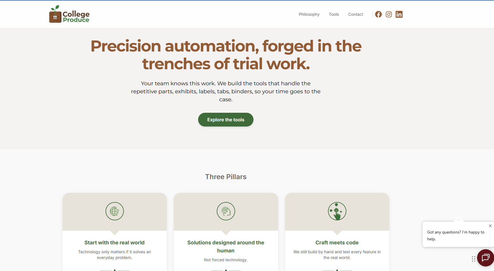
A software studio building automation tools for litigation teams — the repetitive end of trial preparation: exhibits, labels, tabs, and binders. The site had to speak to lawyers, not to engineers.
Brief
College Produce builds tools for people who spend their days preparing for trial. The audience is senior, busy, and sceptical of software that promises more than it delivers. The site needed to establish credibility in the first few seconds without resorting to the usual technology language.
Approach
The homepage leads with the work rather than the product — the hero speaks about trial work before it mentions software. Three pillars sit directly underneath, each one short enough to read at a glance, so a visitor understands the philosophy before being asked to look at any tools.
Design
A warm palette of forest green and earth brown on off-white, chosen to feel closer to a law office than a software company. Generous spacing, a single accent colour for actions, and typography sized so long paragraphs stay comfortable on a wide screen.
Build
A responsive front end that holds its structure from wide desktop down to phone, with the navigation, pillar cards, and tool sections all reflowing rather than shrinking. Live chat is integrated without letting it dominate the page.
ExhibitPro
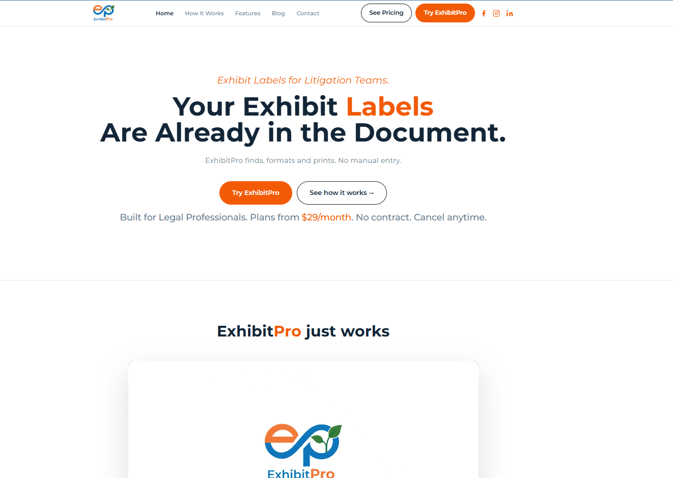
A subscription tool that finds, formats, and prints exhibit labels straight from a document. The site's whole job is to make a narrow, unglamorous product feel obviously worth thirty dollars a month.
Brief
Exhibit labelling is a task most litigation teams do by hand and nobody enjoys. The product removes it. The difficulty was that the problem is invisible to anyone outside the field, so the site had to name the pain precisely enough that the right visitor recognises it instantly.
Approach
The headline states the insight rather than the feature — the labels are already in the document. Pricing appears in the hero instead of being hidden behind a click, because for a product at this price the number removes hesitation rather than creating it.
Design
A confident orange against deep navy on white, with the accent reserved almost entirely for the primary action so the eye always knows where to go. The three-step story — select, format, print — is carried through the page as its spine.
Build
A marketing site built to convert: a persistent trial call-to-action in the navigation, a supporting blog, and a contact route, all responsive down to phone width where a good share of legal-sector traffic arrives.
Yours could be the next one.
Tell me what the site is for and roughly when you need it. I will come back with an honest view of what it would take.